An AutoGUI for Curve Fitting in Python
One of the most basic tasks in science and engineering is fitting a model
to some data. Doing so in Python is strait forward using curve_fit from
scipy.optimize. In the same way seaborn builds on
matplotlib by creating a high-level interface to common statistical
graphics, we can expand on the curve fitting process by building a simple, high-level interface for
defining and visualizing these sorts of optimization problems.
Preface
Where is this coming from?
I’ve had a version of this working for years, I’m sorry to say. It started back when I was in graduate school at the University of Louisville. I was doing a thesis in Astrophysics where I was trying to fit Voigt profiles (kind of like a Gaussian) over a local polynomial continuum in stellar spectra. There was already software that sort of did this but I was learning Python and wanted to program it myself so that I could be sure of it’s implementation (which resulted in a version of this being included in a python package for astronomy I put on GitHub - SLiPy a few years back).
In the years that followed I found myself teaching an advanced physics laboratory course at the University of Notre Dame, and once more this sort of analysis was important. I had students learning scientific computing using tools like Matlab and Mathematica, and I even convinced a few to give Python a try. I knew what was possible with Python using numpy, scipy, matplotlib, pandas, etc. I even demonstrated this capability to many people. The issue was the heavy lift necessary to construct such a custom interface for every lab project.
I wanted to create something that could automatically generate a simple and visually modern graphical interface to fitting data that significantly lowered the barrier to entry for novice users – but something simple enough that they could read the code and appreciate how strait forward it is to build something like this in Python!
DataPhile
A Python package for data analysis and data processing
I’m going to have to write a whole blog post dedicated specifically to what in the world this thing is – DataPhile. I’ve been collecting some of my existing code that I carry with me from project to project into a Python package.
Everything for this functionality presented here was put into one place, dataphile.statistics.regression.modeling. This module contains four things:
Parameter
A structure that associates a value with an uncertainty and bounds.
m = Parameter(value=2, bounds=(1,3), label='slope')
b = Parameter(value=1, bounds=(0,2), label='intercept')
Model
Brings together an analytical function and it’s parameters.
def linear(x, *p):
    return p[0] + p[1] * x

model = Model(linear, b, m)
model.fit(xdata, ydata)
CompositeModel
Superimpose several discrete models.
A     = Parameter(value=1,   bounds=(1/4, 2), label='amplitude')
x0    = Parameter(value=1,   bounds=(0, 2),   label='centroid')
sigma = Parameter(value=1/2, bounds=(1/4, 1), label='width')

def gaussian(x, *p):
    return p[0] * np.exp(-0.5 * (x - p[1])**2 / p[2]**2)

model = CompositeModel(Model(linear, b, m),
                       Model(gaussian, A, x0, sigma),
                       label='gaussian_with_background')
model.fit(xdata, ydata)
AutoGUI
Given a subregion (bounding box) of an existing plot (figure and curve) and the model, create interactive widgets on that figure. Sliders for each parameter of a model, and if a CompositeModel, radio buttons to select between each component.
graph, = plot.step(xdata, ydata, 'k-')
gui = AutoGUI(model, [graph], bbox=[0.50, 0.10, 0.40, 0.20],
              data=(xdata, ydata))
The Model and Parameter objects are an unnecessary abstraction other than to make things more explicit. Even the CompositeModel which is handy for combining a larger number of more basic models (because it’s hierarchical) is not really necessary.
Be that as it may, having this well defined structure with sophisticated interfaces makes the implementation of the AutoGUI very easy to understand. Disregarding the empty lines, comments, and docstrings, the whole things is only like 250 lines of code!
In a sense, this is almost the whole point of this effort. I don’t know of any other language that could put together this interface so easily.
Complete Example
Gaussian Peaks
Let’s reproduce the movie shown at the beginning of this post. We will need to create an example (i.e., synthetic) dataset and then model it.
In this example, let’s image an actual scientific context. Let’s say we have a detector that gives us a count of events across 2400 channels. This is in a sense a histogram. If we are measuring some physical quantity, create bins across some domain of the possible values and increment each bin anytime a new value comes in within its respective subdomain.
We’re going to overlay 24 Gaussian features on top of some underlying distribution. These features would in the real world be some signal we wanted to quantify. As in all cases, the instrument system (the detector and everything connected before and after it) is not perfect. So each channel is biased to be more or less sensitive to counting.
Create a base distribution of x,y values representing the underlying bias in a detector (a polynomial with a little bit of a downward curve just to be interesting).
from dataphile.datasets import SyntheticDataset
from dataphile.statistics.distributions import polynomial1D

xdata, ydata = SyntheticDataset(polynomial1D, [100, -0.01, -1e-5], (0, 2400), linspace=True,
                                noise=0, samples=2400).generate()
Over top of the underlying bias distribution, create 24 gaussian features with varying heights and widths and a 0.015 S/N. These will be superimposed on top of each other and the bias curve.
from dataphile.statistics.distributions import gaussian1D
import numpy as np
np.random.seed(33)  # reproducibility

N     = 24
A_s   = np.random.uniform(50, 150, N)
x0_s  = np.random.uniform(100, 2300, N)
sig_s = np.random.uniform(10, 20, N)
peaks = [SyntheticDataset(gaussian1D, [A, x0, sig], (0, 2400), linspace=True,
                          noise=0.015, samples=2400).generate()[1]
         for A, x0, sig in zip(A_s, x0_s, sig_s)]
Keep the bias so we can look at individual peaks later on in the graph.
bias = ydata.copy()
ydata += sum(peaks)
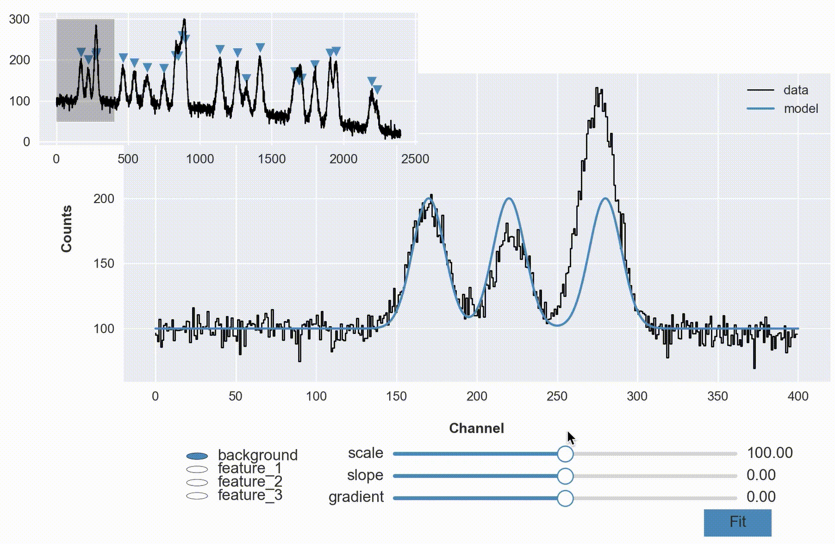
Create both a plot of the entire dataset (marking the location of the features) and a larger plot of the extracted region which we will optimize a model against.
from matplotlib import pyplot as plot
from matplotlib import patches
plot.style.use('seaborn-notebook')
%matplotlib notebook
figure = plot.figure('Gaussian Peaks Demonstration with AutoGUI', figsize=(9, 5))

# select subregion of dataset for larger graph
xdata_i = xdata[xdata < 400]
ydata_i = ydata[xdata < 400]

# create main plot of data
ax_1 = figure.add_axes([0.15, 0.14, 0.84, 0.70])
data_graph, = ax_1.step(xdata_i, ydata_i, color='black', lw=1, label='data')

# labels
ax_1.set_ylabel('Counts', labelpad=15, fontweight='semibold')
ax_1.set_xlabel('Channel', labelpad=15, fontweight='semibold')

# create smaller graph of entire dataset
ax_2 = figure.add_axes([0.05, 0.63, 0.45, 0.34])
little_graph, = ax_2.step(xdata, ydata, color='black', lw=1)

# overlay small markers showing location of features
xloc, yloc = x0_s, [(bias + peak).max() + 25 for peak in peaks]
markers = ax_2.scatter(xloc, yloc, marker='v', color='steelblue')

# show zoom-rectangle around region of main plot
rectangle = patches.Rectangle((0, 50), 400, 250, color='black', alpha=0.25)
ax_2.add_patch(rectangle);

The idea is pretty strait forward - we have some number of features (blended no less) over a polynomial background. Our goal is to represent that analytical model in code so we can optimize it against the current dataset and to some degree of certainty measure quantities (e.g., location of peaks, widths, etc.).
In this case I’m going to explicitly code some reasonable guesses for each parameter, but more generally, one could programmatically/algorithmically take a stab at values (especially if this is something you’ll need to do frequently).
from dataphile.statistics.regression.modeling import Parameter, Model, CompositeModel, AutoGUI

model = CompositeModel(
    Model(polynomial1D,
          Parameter(value=100, bounds=(0, 200),      label='scale'),
          Parameter(value=0,   bounds=(-0.1, 0.1),   label='slope'),
          Parameter(value=0,   bounds=(5e-5, -5e-5), label='gradient'),
          label='background'),
    Model(gaussian1D,
          Parameter(value=100, bounds=(10, 300),  label='amplitude'),
          Parameter(value=170, bounds=(100, 300), label='center'),
          Parameter(value=10,  bounds=(5, 20),    label='width'),
          label='feature_1'),
    Model(gaussian1D,
          Parameter(value=100, bounds=(10, 300),  label='amplitude'),
          Parameter(value=220, bounds=(100, 300), label='center'),
          Parameter(value=10,  bounds=(5, 20),    label='width'),
          label='feature_2'),
    Model(gaussian1D,
          Parameter(value=100, bounds=(10, 300),  label='amplitude'),
          Parameter(value=280, bounds=(100, 300), label='center'),
          Parameter(value=10,  bounds=(5, 20),    label='width'),
          label='feature_3'),
    label='gaussian_peaks')
Overlay a graph of the model on the data.
xsample = np.linspace(0, 400, 1500)
model_graph, = ax_1.plot(xsample, model(xsample), color='steelblue', label='model')
ax_1.legend();
figure # display the graph again

Adjust the position of the plots (shift them up) to make room for the gui widgets.
ax_1.set_position([0.15, 0.30, 0.84, 0.56])
ax_2.set_position([0.05, 0.73, 0.45, 0.24])
gui = AutoGUI(model, [model_graph], bbox=[0.20, 0.07, 0.75, 0.12], figure=figure,
              slider_options={'color': 'steelblue'}, data=(xdata_i, ydata_i));
And after applying the fit, display the resulting values.
model.summary()
| value | uncertainty | ||
|---|---|---|---|
| model | parameter | ||
| background | scale | 98.957184 | 1.244100 |
| slope | 0.019271 | 0.019389 | |
| gradient | -0.000077 | 0.000047 | |
| feature_1 | amplitude | 92.716720 | 2.125195 |
| center | 170.121278 | 0.284692 | |
| width | 11.666650 | 0.324439 | |
| feature_2 | amplitude | 72.637965 | 2.223527 |
| center | 222.065818 | 0.354500 | |
| width | 11.048723 | 0.394525 | |
| feature_3 | amplitude | 177.272596 | 2.106137 |
| center | 276.123253 | 0.146741 | |
| width | 11.375918 | 0.163587 |
from IPython.display import display, Image
display(Image(filename='auto_gui_interactive.gif'))
This entire demonstration can be reproduced by calling GaussianPeaks along with two others (Linear and Sinusoidal) from the dataphile.demos.auto_gui module.
from dataphile.demos.auto_gui import Linear, Sinusoidal, GaussianPeaks
demo = GaussianPeaks()
Whatever your particular project is, whatever your domain, this could be used to create your own custom implementation. That is, if your data consistently looks a certain way, wrap all of this up in another function so that the next time you get a dataset, you can just call that function in your notebook without having to reproduce all of this every time.
Appendix
What was up with those super awesome sliders?! (this deserves it’s own blog post)
Matplotlib has some pretty awesome functionality using the widgets module. These days, the slider widget can seem a bit dated; with Jupyter Notebooks, web based widgets via something like ipywidgets are becoming popular because they look so great compared with the matplotlib aesthetic.

What I like about Matplotlib and it’s widgets though is that you have so much control over how and where they are constructed. You can also blend them more naturally into the figures you are already creating with matplotlib (and they work without the notebook!).
So about a year ago I was thinking about this and I had a rather clever idea, why not use matplotlib itself to create a widget?! That is, create my own aesthetic with colors and shapes, and manipulate those with the existing matplotlib slider widget (above) by laying it on top and rendering it invisible?!
So that’s what I did (available with dataphile.graphics.widgets.Slider). I mirrored the matplotlib Slider interface and created a second axis with a bottom line (for the “track”), a shorter line for the slide, and a scatter plot of a single point for the “knob”. When you call the on_changed function for this slider, it wraps the update function you pass with another one that also updates the plot elements drawn as a dummy slider.

It takes a minute to sort of appreciate this. The actual slider has had all its features made to be invisible. So when your mouse interacts with it, the underlying dummy features are made to update as if a puppet.